ABOUT
FEEDSCONTACT
EMAIL DIGESTCANDY RATINGSTYPE
BRAND
COUNTRY
ARCHIVES
|
Friday, June 6, 2008
Candy Blog Photography
Now that you’ve seen my current photo studio, I thought I’d back up a bit and show you how I used to take photos before 2006, because you really don’t need all that if you’re on a budget and especially if you’re not doing the volume I do. WHAT I SHOOT WITH My camera is the Sony DSC-V3. I bought it used on eBay for $375 in March 2006 and it included a 1 gb memory card (which I actually fill up in one photo session from time to time but more importantly it’s fantastic for my whale watching). WHERE TO SHOOT I had two spots I liked to take photos:
I didn’t have a tripod, I’d just place the camera on a book or notebook (angled if I needed it), set the shot up and then turned on the timer (this left both hands free for holding the cardstock for bouncing the light).
The light was much better up there, most the time I’d set up a piece of white posterboard, sticking one side to a cardboard box and letting it slope down onto the surface of the table. This was under a white patio umbrella, which provided a nice diffuse light and of course I’d use the other pieces of posterboard for bounce. On these occasions I used a tripod, which gave me much more control and crisper shots.
While some folks call my old methods a little ghetto, I still take photos like that from time to time. Just some white office paper to grab a quick snap and when I’m traveling, sometimes I pick up some posterboard so I can take some product shots on the road. The other option, of course is to get some studio lights. The photo of my studio looks kind of jumbled, and believe me, it’s pretty much chaos all the time. SETTING UP THE SHOT While the photos may show the candy isolated in the middle of nothingness, believe me, there’s lots nearby.
Silver reflective packaging is a bugger to shoot, everything has to be masked around it or else it shows up as a reflection. I have a piece of white posterboard with a little hole the size of my lens for just such occasions. The bonus is that it also bounces a good deal of light, so it gives a crisper, more even exposure. The trick here is to light the background and foreground at the same level. This will give the best base for the high key white. I also keep the objects quite close to the edge of the table, about 1/3 of the distance to the curve of the back (you can see that I didn’t do that in earlier shots, that’s part of what creates that shadowy background). A tripod is essential to product photos. It’s the best way to get clear and sharp photos, especially for longer exposures. Tripods are not expensive, so even if you can’t afford a shooting table like this, get a tripod.
I work from the outside to the inside. It’s common sense, but something I’ve messed up on before. I shoot the outside of the package (sometimes right after I buy it and don’t complete the rest of the process until I schedule the review), then open it, shoot the item with the wrapper, sometimes solo ... then and only then do I break it open or take a bite. Sometimes, if I have a bounty of individual items, I’ll do several versions to get the best “bite with caramel pull” or “cross section of panned nut.” At the end of the session I usually have a dish of bitten candies. The shooting surface is a matte plexiglass. I wipe it down with 409 quite often, either because it’s gotten sticky or because I plan on eating whatever I place on there later. When I was shooting on posterboard I would often throw a piece of white office paper down when I knew I was going to have something gooey. POST PROCESSING THE SHOT
I always take pictures on the highest setting (the full 7.2 megabytes). Most of the time I use the plain old JPG setting, since these photos are for web. If I were doing something for print, I’d probably use TIFF or RAW - but then I’d run into storage issues. As it is I have about 60 gb of candy photos. If your camera has something called bracketing in the settings, I recommend giving it a try. It bumps the exposure up one level and down one level, taking three shots pretty much at the same time. This is a good way to see what levels would be best for a particular shot without moving the settings. For the most part I use the program mode (P) on my camera. I set the exposure bumped up to +1.7, even so, the background rarely turns out white. It’s gray.
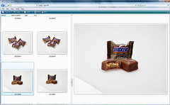
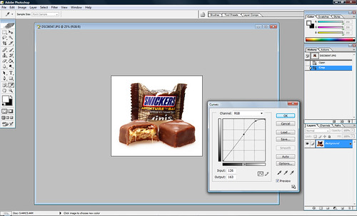
If I’ve done everything right then all the photo needs is a little adjustment in the Photoshop Image > Adjustments > Curves menu. I push the upper white a little brighter and usually pull down the midtones a little darker. That’s it. BTW - you don’t even need the full Photoshop to do this. Photoshop Elements (which I got for free with my Wacom graphics tablet) works perfectly fine. Some other free image adjustment programs also do a great job - the best thing to do is take a great shot that needs only a few adjustments. But sometimes I’m sloppy and a few more adjustments are necessary. I might clone out some crumbs and sometimes the corners are a little darker for very large field shots so I’ll whiten them with the eraser or paintbrush.
Then things might need a little additional help, maybe a little burning/dodging for glared spots or things that are too dark in the shadows and lose their detail. Cross-sections might need a bit of dodging to enhance the difference between the caramel & nougat or at least bring up the contrast in that small area.
RESIZING FOR THE WEB For the most part I’ve moved to Flickr to host my photos and share them there (for a while I had them both on my own server and on Flickr). Flickr automatically resizes the photos to three useable sizes: 100 pixels, 240 pixels and 500 pixels. Flickr has a limited but good photo editing service called Picnik that will allow you to do some of the above adjustments right there. Picasa also offers some excellent hosting & editing services. If you’re hosting your own photos it’s usually best to use your photo software to create the web version so that it will be sharp and small at the same time. Photoshop has a “save for web” feature that allows you to preview exactly what the photo will look like saved at various compression settings. DEVELOPING A STYLE The style of Candy Blog photos is supposed to be clinical. My original idea with my photography was for it to be a true representation of both the candy and the package. Because the blog was supposed to do what I wanted the internet to provide for me - a breakdown of what that candy actually is. (I couldn’t find a site that did that, so I made one.) I like the photos on a blank white background, no background stuff to interfere. It isolates the subject and it really helped me to focus on just the candy itself, if only for that brief session when I photographed it. Yes, many of them are quite tasty looking, but I’ve always done my best to show what the candy actually looks like. I’m not trying to sell you anything. (There first dozen or so posts on Candy Blog actually don’t have the candy featured. It wasn’t until a couple of weeks later that I realized that’s what people really wanted to know ... what’s inside that box.) I set up my shots to be eye level with the candy for the most part, like the candy is as big as you are. TIPS FOR SHOOTING GOOD PHOTOS TIPS TO MAKE YOUR PHOTOS EVEN BETTER
More reading: Related Candies
POSTED BY Cybele AT 8:42 am Behind the Scenes • Candy • Featured News • Photography • Thursday, June 5, 2008
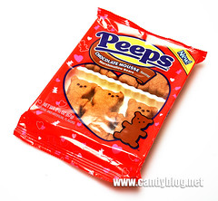
Peeps Chocolate Mousse (Bears & Bunnies)
The first version will premiere next Valentine’s Day in the shape of Peeps Chocolate Mousse Marshmallow Bears. I’m not sure why there hasn’t been a bear shaped Peeps all along, they’re an ideal Valentine’s emblem (and really, why can’t we have Bear Peeps all year round?). However, this package is all about love, with its red wrapper & little hearts. The packages I got were for evaluation purposes only, so I don’t have the complete nutritional info & ingredients list. I decided to open the Peeps Chocolate Mousse Marshmallow Bunnies for the purposes of the review.
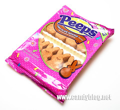
Look familiar? They’re nice looking, medium brown. They’re sparkly with the light sanding of sugar. (I’ve often wondered what corn starch dusted Peeps would be like.) They’re extremely soft, softer than regular Peeps are, if you ask me. They smell like chocolate breakfast cereal, like Cocoa Puffs.
But the big question, at least in my mind, was are these different from the Cocoa Peeps? I just so happened to have a package of Peeps Cocoa Marshmallow Bunnies (left) for a direct comparison. Though they looked similar in my memory, putting them side by side, it’s easy to see that the new Mousse Peeps are darker. The cross section shows that the Mousse Peeps is cocoa through and through, where the only slightly creamy colored on the inside.
They’re great with coffee but like the Cocoa version, it’s very hard to get them stale. I’ve had this package open for two weeks and they’re still pretty squishy. However, these are awesome broiled. The center becomes frothy and runny and the sugar dust becomes a crunchy shell. I put them in the toaster over for 3 minutes. Be sure to have them on foil or parchment or else they run all over the place. You also might need a spoon to eat them. Microwaving also gets the same soupy center, but the outside doesn’t get crispy (so it’s the confectionery equivalent of trying to make pizza in a microwave ... it’s edible but it’s not the same). In the end, I’m more inclined towards the Chocolate Mousse Peeps than any other Peeps to date, but that’s not necessarily a rave review. For the record, the available shapes for Peeps are: These should be in stores starting in January, but you can also buy many Peeps items all year round now directly from Just Born. Related Candies
POSTED BY Cybele AT 8:09 am Wednesday, June 4, 2008
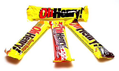
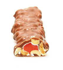
The Oh Henry!s
It was often billed as “the ten cent piece of dollar candy” and became popular in Chicago eventually expanding as a national candy bar through the tenacious efforts of John Glossinger (whom Glosettes are named after). Williamson Candy, at some point, sold out to Ward-Johnson which was swallowed up by Nabisco in 1981 (which was also holding the Curtiss bars - Baby Ruth & Butterfinger included- at that time). Finally in 1990 Nestle bought the Curtiss bars, SnoCaps, Goobers & Raisinets from Nabisco. (Some of this is a bit murky and I traced it mostly through trademark registrations, and probably matters very little in the end.)
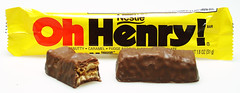
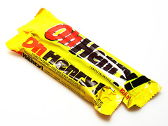
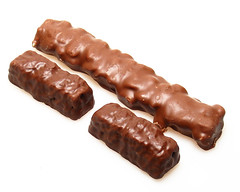
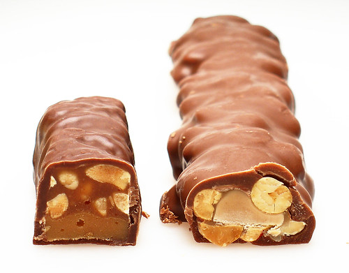
Though the American bar used to be a single, it has now morphed into a double bar (a la Mounds) while the Canadian version remains pretty much the same as it was 30 years ago. The package on the Nestle version says: 2 peanutty * caramel * fudge bars in milk chocolate. It weighs 1.8 ounces (51 grams). It comes sealed in a simple yellow plasticized wrapper. The package on the Hershey version says: crunchy peanuts, chewy fudge, creamy caramel, covered in a chocolaty coating. It weighs 2.2 ounces (62.5 grams). It comes in a mylar wrapper with a small folded paperboard tray.
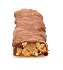
The innards of the two Oh Henrys! tell more about them. The American Oh Henry! is rather organized and stratified. The Nestle one has a caramel base then a fudge mixed with peanuts. It’s all covered in what they call real milk chocolate. It has a nice roasted peanut flavor, but the difference between the caramel and the fudge is minimal. The fudge is a bit saltier, but caramel is short and grainy instead of being chewy and creamy. At first I thought it was just a not-so-fresh bar, so I bought another. And another. This is the third I’ve bought and second I’ve photographed for this review. The two pieces are nicely sized and the flavor balance overall is good. I would prefer some really good creamy chocolate to pull it together, but that’s just not Nestle’s style. The Hershey one reminds me a bit of a narrow Payday Chocolatey Avalanche. The fudge is at the center here and much lighter in color (reminding me quite a bit of a nougat except there are no eggs in it). On top of the fudge is a thin layer of caramel which holds the peanuts. The whole thing is covered in a chocolatey coating (which actually contains real chocolate with cocoa butter, but it also has modified palm oil in it, which takes it out of the real chocolate column). The nuts play a much bigger role here, probably because they mingle with both the (mock)chocolate and the caramel. For fake chocolate, it does a much better job of being creamy and tasty than Nestle’s real stuff. The caramel has a kind of fake butter flavor to it, but this is only noticeable if you take the bar apart and try to eat the elements separately (now why would you wanna do that?).
While Nestle just lets the Oh Henry! bar do its thing here in the States, up in the Great White North it’s another story entirely. Hershey goes to down with the bar. First, it’s one of the largest single-serve bars in Canada, so it’s known as a good value. Hershey also does limited editions and other versions of the bar. I got a hold of a few.
It’s not quite as sweet as the regular Oh Henry! and really quite a nice bar. The dark chocolate gives it a bigger chocolate pop instead of all that dairy-tasting milk chocolate. I could use a dash of salt, but, that’s just me, eh. All of the variation bars are slightly smaller, at only 60 grams (2.12 ounces).
It’s a bit flatter than the other bars. It’s also a bit greasy. This one also has a mockolate coating which isn’t as creamy and just a bit bloomed. It’s really peanutty. It’s also pleasantly salty ... or unpleasantly so if you think that 115 mg is a little much for a candy bar (the standard Hershey Oh Henry! has 50 mg). The peanut center also made the caramel more noticeable, probably because it isn’t as dense and chewy as the fudge. (This one is not a limited edition but appears to be a permanent variation.)
The bar is described on the wrapper: Crunchy peanuts, red chewy fudge, white creamy caramel, covered in a chocolatey coating. This combo results in red and white in every bite!. Yes, that fudge center there is actually red. And maple flavored. Even if it is expired, it was still pretty tasty. I liked the intense maple flavor that permeated the bar. It was like toasted, caramelized pecans. Overally, I much prefer the Canadian Oh Henry! from Hershey, even if it does have mockolate on it. The Dark Oh Henry! is superior to all the others, but since it was a Limited Edition, the original (which by the way, better reflects the American original anyway) will do in a pinch. But given a choice, I’d probably opt for the whole thing sans (mock)chocolate and get a Payday. Related Candies
POSTED BY Cybele AT 11:15 am Tuesday, June 3, 2008
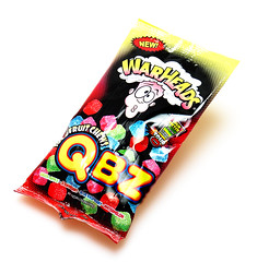
Warheads QBZ
I like the kind of sour stuff that gets the jaw a-tingling, stuff that has a bit of flavor to go along with the intense acidity. Warheads by Impact Confections makes some pretty intensely sour stuff, but their new QBZ are simply rated sour on their intensity scale. (The Warheads Junior Extreme Sour are two steps above.) These little gem cubes come in Green Apple, Strawberry, Blue Raspberry & Watermelon. They’re marketed as “bite-sized, sour-coated cubes don’t stick to teeth like many chewy candies.” I picked these up at Walgreens in a cute single serve package.
They are actually little cubes, a bit irregular but brightly colored. They have a little sugary/sour sanding on them to keep them from sticking together. They have an easy, soft bite, a bit of a cross between a fruit jelly and a gummi (they do have gelatin in them).
These are definitely edible, not something you’d only do for a dare. The flavor mix is fun though I’m mystified why there’s no orange or lemon in there as they are actually flavors that are supposed to be sour. They’re fun to eat either way - you can suck the sour powder off and get a really intense tingly kick or chew it quickly to mix the tangy outer coating with the milder, more flavorful center. I think I still prefer the sour gummi bears, but then again those just had a flavor variety that I prefer. These are also similar to the Albanese Beeps (Caitlin at Candy Addict reviewed them here). Albanese is made in the USA, Warheads are made in China. Preferences aside, these may be easier to find than other, better gummi sour options or, of course, Sour Patch Kids. Related Candies
POSTED BY Cybele AT 8:28 am Monday, June 2, 2008
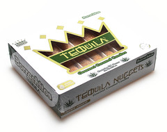
Crown Nuggets Borrachitos
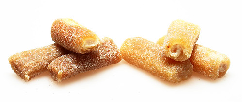
Crown Nuggets sent me this version of Mexican dulce de leche (literally candy of milk) made with tequila. The name Borrachito means “little drunk”, and in this case they’re not kidding. These little fingers of dulce de leche (they call them nuggets) are up to 4% alcohol. (So they may not be available in all states.) As they launch the candy there are two versions available: Tequila & Licor de Cafe. They’re packaged in little plastic tubs with the fingers separated by cardboard dividers, two layers deep, 12 in each layer. At over 9 ounces per package, they’re pretty dense little candies.
The Tequila Nuggets are on the right in this photo. You can see that they’re kind of a layered affair. The center is a smooth & creamy light caramel, almost like a pudding, then it’s rolled in sugar to keep them from sticking to each other. The drunken part is pretty evident when I opened the package. It smells like sweet tequila and a little bit like cotton candy. I’ve had tequila before, but I don’t drink it straight and it’s not my preferred liquor. The idea of it mixed with some sweet and thick dairy was pretty appealing though. The little fingers are soft, but the sugar coating keeps them from being sticky. I ate them in two bites, they’re about the size of the top two knuckles of my pinky (I can’t say how big your pinkies are). Inside the grainy exterior is a soft and creamy caramelized milk. The tequila flavors are a little overwhelming at first, but the dairy flavors come out slowly. It’s soft and melts well on the tongue. I find the sugar grains make it a bit too sweet and mess with the custardy texture of the dulce de leche. Tequila is a bit medicinal but definitely add a bit of dimension to this.
These had a bit of a coffee note to them and a little bit of a rum taste. I was hoping both of these would be more caramelized or milky tasting. It was darker, but not quite smoky or burnt enough for me. I like a good flan or creme brulee and I was hoping this would be a confectionery equivalent. The alcohol, while definitely evident, may have overshadowed that. I think mainstream America is ready for some good dulce de leche. These appear to have overcome some of the issues of how to portion it and make it look appealing. It’s probably a good idea to capitalize on the tequila angle too, so I don’t begrudge the inclusion. But the flavor/texture mix just isn’t for me. I’m not going to give up on finding my ideal dulce de leche. The nutrition panel is calculate for a single piece (11 grams & 40 calories) so it says there’s no fat in here, but since the second ingredient is whole milk, I’m guessing if you ate a full ounce (three pieces) your body would find some usable dairy fats in there. I don’t care much for eating them as a confection on their own, but in combination with some bittersweet chocolate or even as part of a dessert cheese plate with dried fruits & nuts, they might be an interesting addition. For more on dulce de leche: Malena travels Mexico & samples cajeta, Rosa at ZOMG Candy already reviewed Borrachitos and if you’re ever interested in making your own, it’s a simple as submerging a can of sweetened condensed milk in a pot and simmering it on the stove (or following a more traditional open pot method by Alton Brown or David Lebovitz). Related Candies
POSTED BY Cybele AT 9:55 am Page 333 of 584 pages ‹ First < 331 332 333 334 335 > Last › 
|
Meticulously photographed and documented reviews of candy from around the world. And the occasional other sweet adventures. Open your mouth, expand your mind.
SEARCHSearch the Candy Blog archives
    
FEATURED NEWS ITEMS
COPYRIGHT NOTICEAll content (text and photos unless otherwise credited) is copyright 2005-2026 by Cybele May Please do not use my photos without prior permission directly from me, they represent what I ate in preparation for these reviews and are not to be used for other purposes. Design by Hop Studios
|
|||||||||||||||||||||||||||||||||||||||||||||||||||||||||||||||